The impact of Bauhaus in GraphicDesign
Although much of the Bauhaus’ contribution to graphic design was theoretical, there are nonetheless some key visual hallmarks of the school which designers still use today, including:
A distinctive palette of primary colors or, alternatively, black and white combos paired with a single color, like red or blue.
Collage graphics. Isolated figures and human features, like hands and eyes, that were often used in Bauhaus poster designs, giving them a surrealism aesthetic.
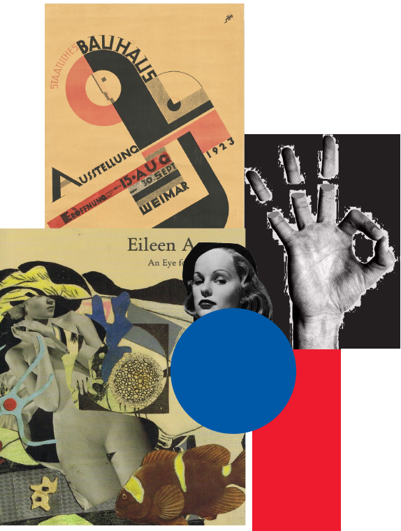
Experimental layouts and “broken” grids. Pre-empting the anarchic “gridless” layouts of the 1990s designers like David Carson by 70 years, Bauhaus students were abandoning formal grids, decades ahead of their time.
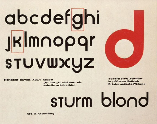
Geometric and minimalistic typography. Many of the modernist fonts we use today, were directly inspired by typefaces designed by Bauhaus members. Herbert Bayer’s experimental Universal typeface is probably the most famous of the Bauhaus type designs (font name: P22 Bauhaus)
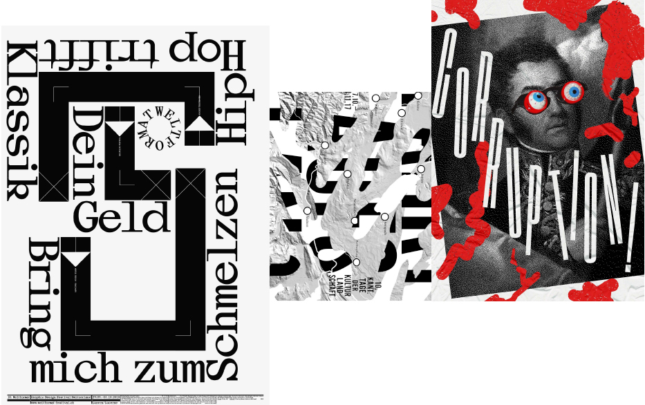
Bauhausis more relevant than ever
We celebrate 100 years of experimental design on modern typography, 100 years of unmolded creativity. We celebrate expressive design without rules. As designers, we are doomed to follow rules of communication and design, in order to produce functional visuals every single day. But this celebration calls us to put our creativity and experimentation in full motion and set our own rules for our own designs. Here there are no wrong decisions.
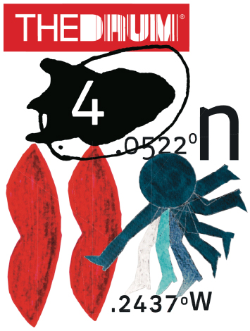
We are paying tribute to the world of art and design, to expressionism, to modernism, to history itself. Behind this action lies a symbolism, a solid set of ideas that are linked with strong meanings which define the way we create, the way we work, the way we see the world around us.
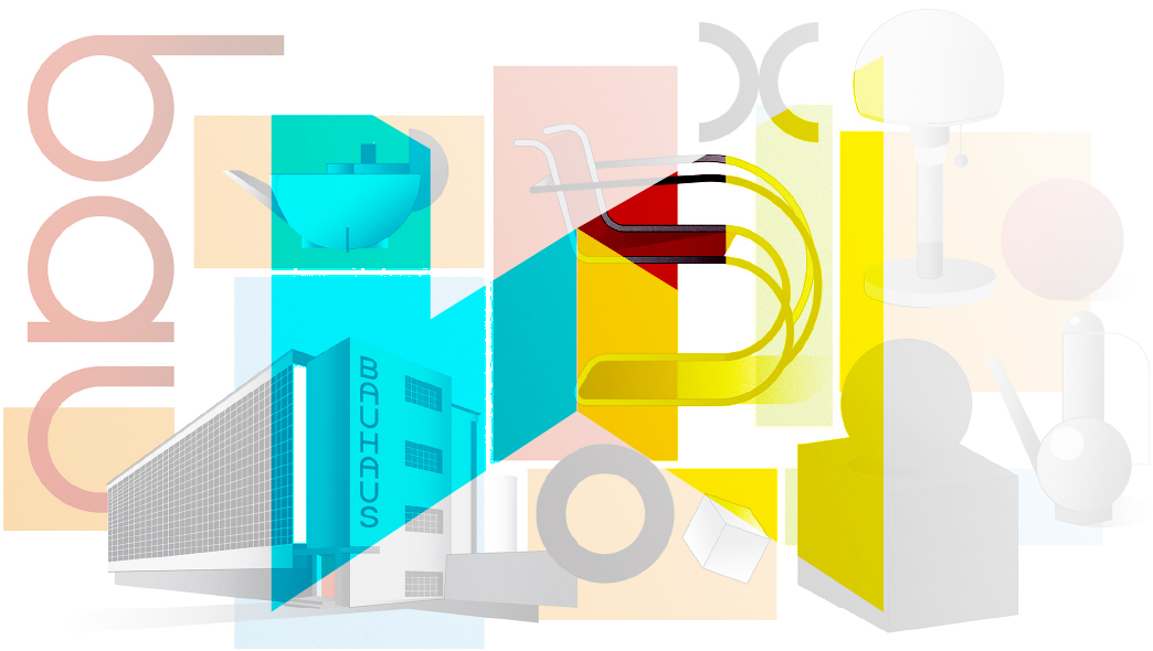
We are promoting, in essence, the value of collaboration, a value that became the underlying principle of the Bauhaus –a school that combined the education of arts, architecture and craft with the vision of producing complete works of art.
TheProjects
We wanted to offer you an interactive experience of the Bauhaus movement, in order to make you think, create, experiment and be completely exposed to its philosophy. We also wanted it to be simple, graphic design oriented and, of course, fun. The result was three creative concepts that we loved. Sadly, we had to choose only one but we decided to present you the whole shortlist because, well, it’s worth it.
CONTENDER 1:
THE TYPO CONCEPT
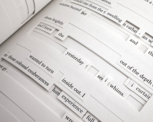
A compilation of phrases from Interweave’ s manifesto, deconstructed into spare words and letters, all painted in the Bauhaus color palette.
HOW IT WORKS:
The user (you) would have to blend those materials
to create color and word combinations. The whole
point here isn’t the meaning or the functionality
of the resulting piece, but to use your creativity
and imagination in order to create your own syntax,
with your own rules and design principles.
CONTENDER 2:
THE FLYERS CONCEPT
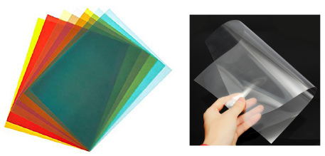

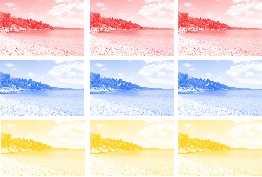
Three monochromatic photos depicting idyllic Greek landscapes,
each one colored with one of the 3 dominant colors of Bauhaus. Attached
with them, a set of transparent filter papers, in the same color palette.
HOW IT WORKS:
It’s all about the joy of creation through play.
Imagine having a compact version of Photoshop with
just some basic effect tools (filters, multiply,
overlay, inclusion), but in analog form. Just
put everything together, in whatever way
you wish, experiment and create your own piece of art.
THE WINNER:
THE NOTEBOOK CONCEPT
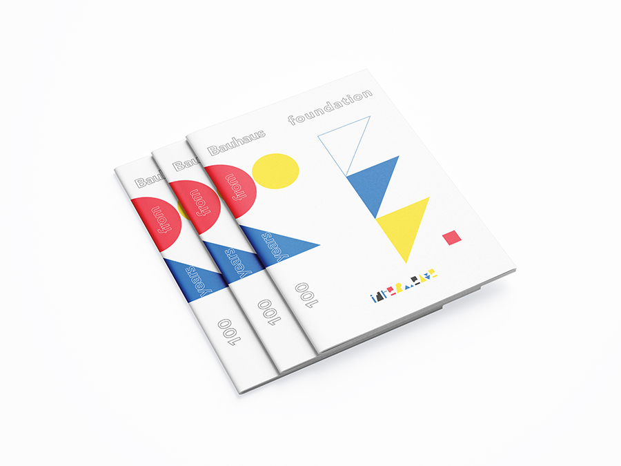
At the end of the day, it’s all about learning –but doing so in a dapper manner. A sleek notebook, containing the founding principles of Bauhaus and the heart of its philosophy, while at the same time providing you with some entertaining stuff to play around, express your creativity and have fun with it.
In the end, it all comes down to the core intention of Bauhaus, as an art movement. Something all of us creatives should aspire to and aim for:
Reunite fine art and
functional design.
Create a practical object
with the soul of an artwork.


