
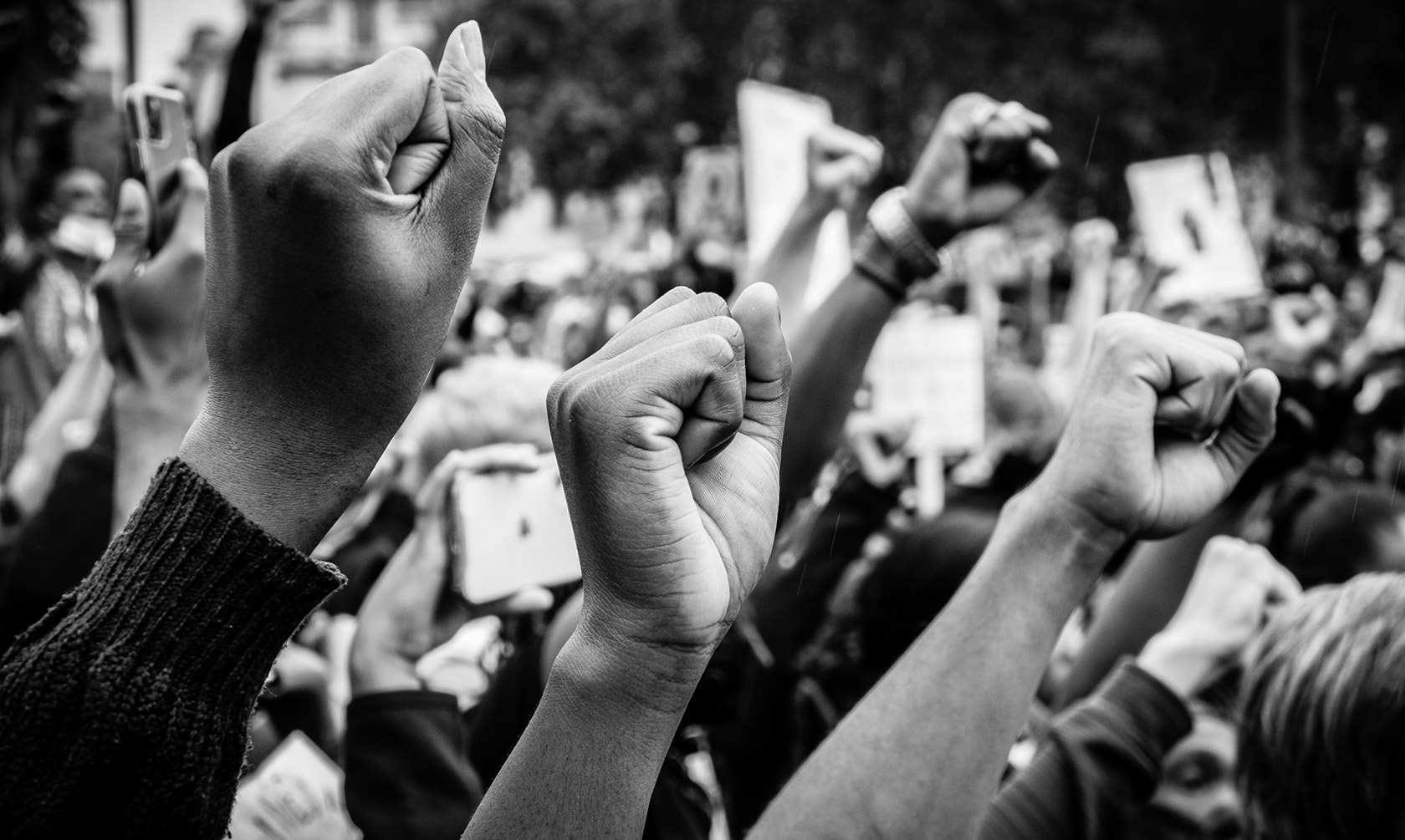

Having already been quite active in the international public sphere for several years, the Initiative for Social Entrepreneurship wished to create a foundation, under which to support a systemic transformation of society, in a more holistic way.
Interweave was asked to create a holistic brand identity for the new foundation, the Guerrilla Foundation, with a strong, standing out positioning, that would be able to inspire and engage people to specific values – as well as the Foundation’s website.
After several immersion sessions, combined with in-depth analysis on the initiative’s goals, needs and aspirations, as well as, thorough research in the social entrepreneurship field, we crafted a whole new universe in which the brand will act and cause reaction, along with the strong will to participate.
Putting its mission into words, determining its values and personality, defining its unique proposition and the benefits it brings to people and, finally, setting forth its essence -what it stands for above all,- was just the first chapter in this fascinating branding story. There were more, equally exciting, things to follow: a name inspired by the Guerrillas, the early 19th century Spanish freedom fighters; an inciting tagline, accompanied with a strong, motivating narrative; a full, well-designed visual identity; and, last but not least, a beautiful website.
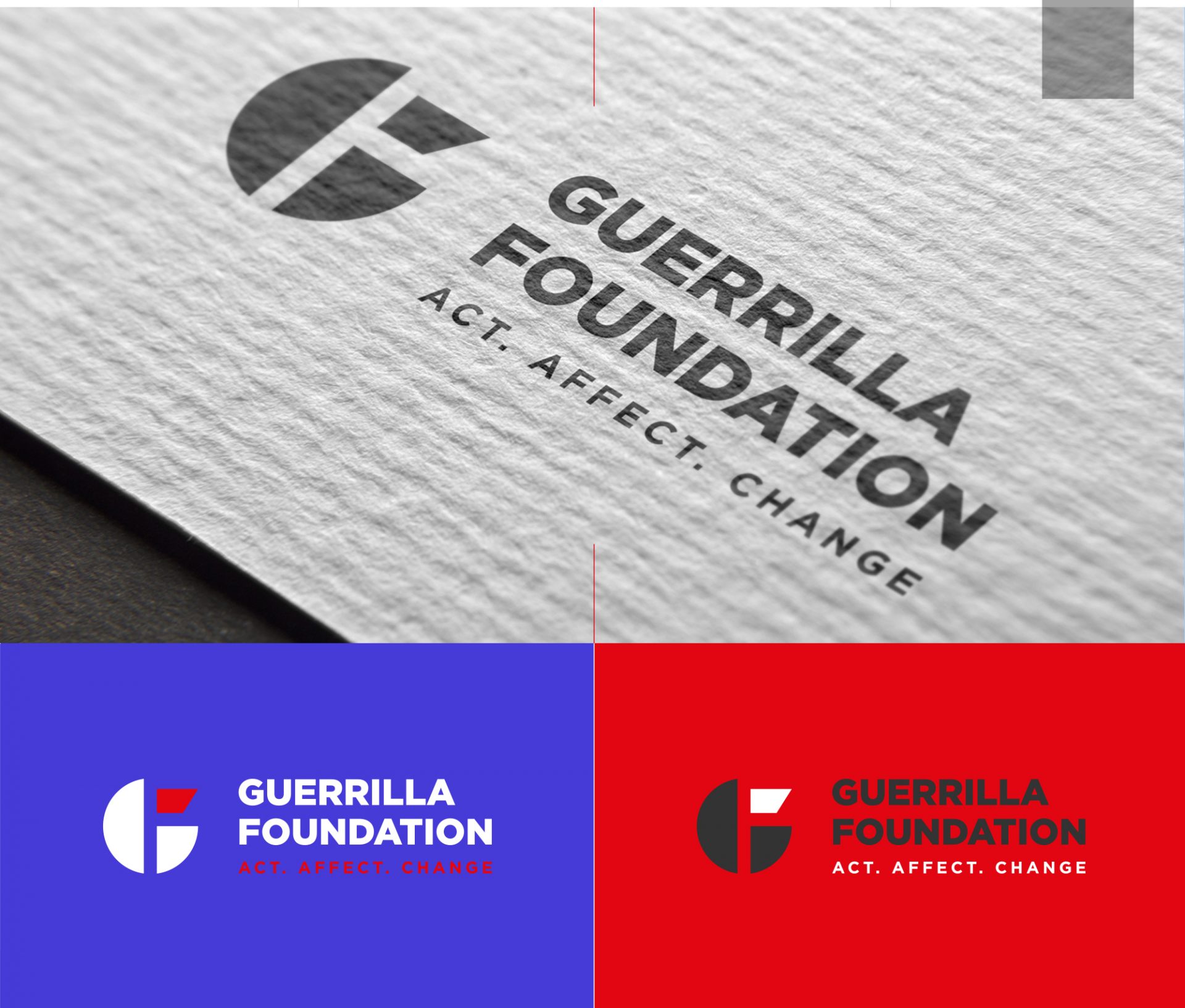
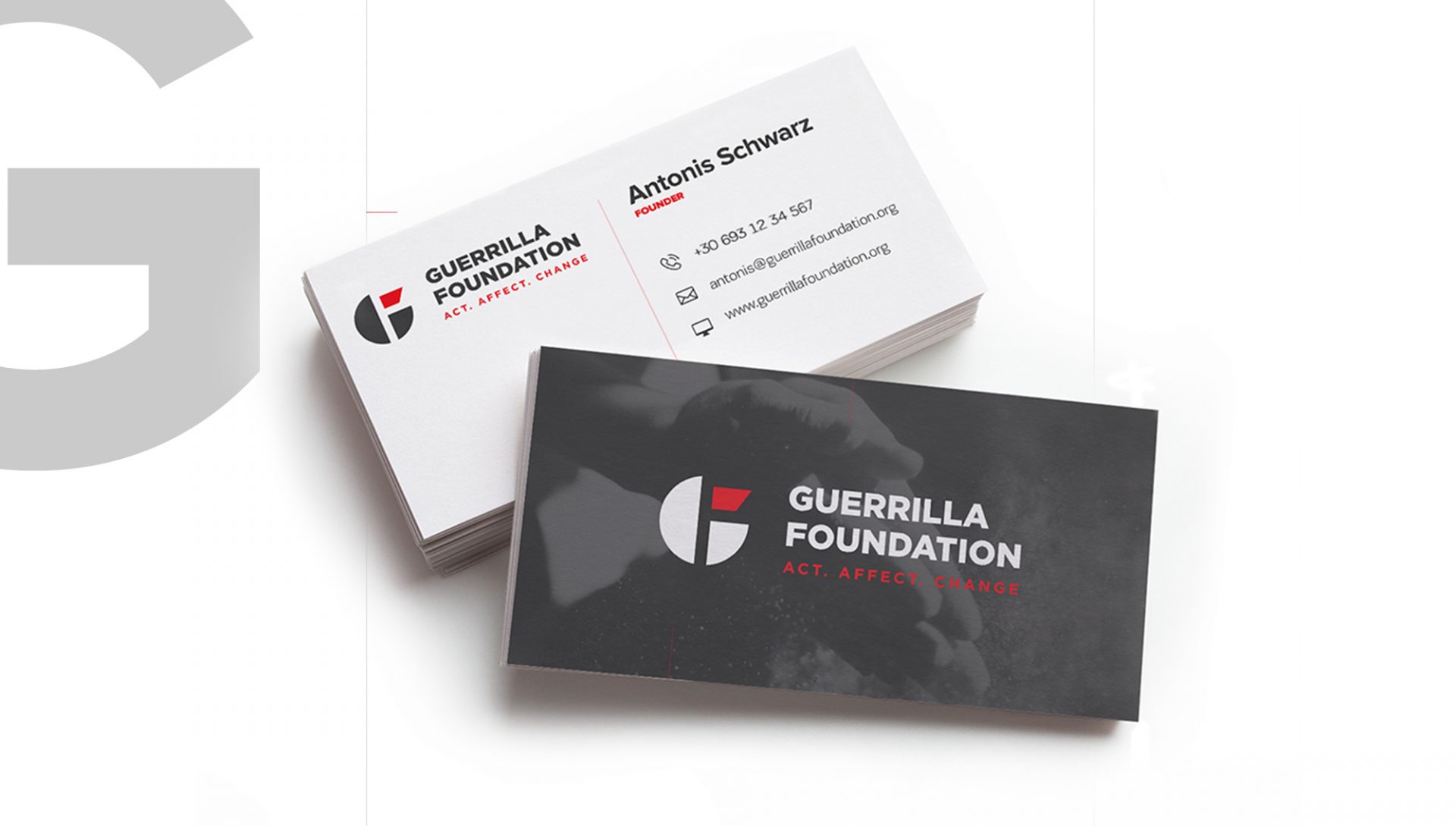
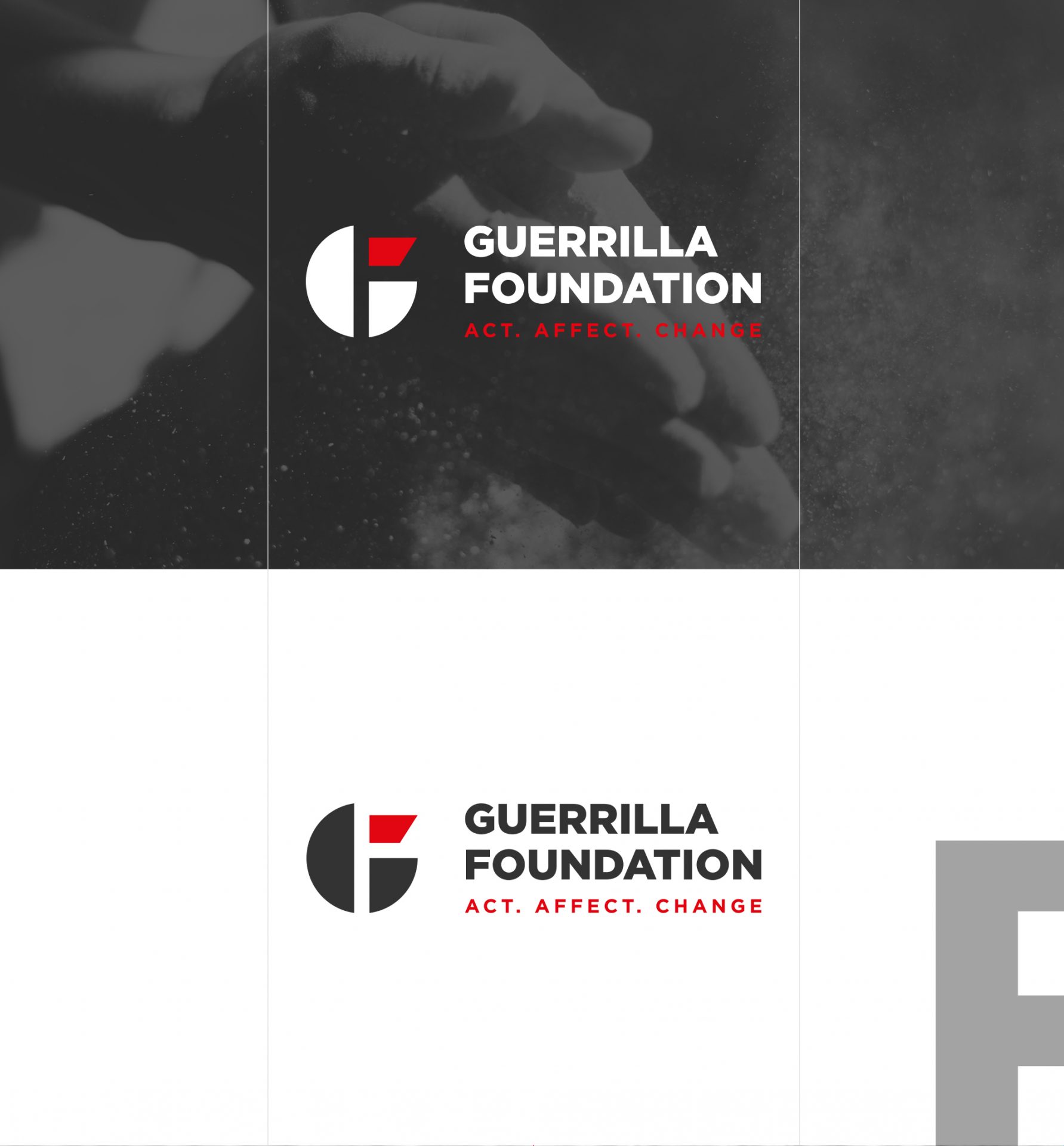
As integral part of a holistic corporate identity, creating Guerrilla Foundation’s complete visual identity was one of the pillars of this project: a logo that stands out because of its elegant, minimal design illustrating all brand positioning aspects in a solid way – and everything that comes along: typography, colour palette, letterhead, business cards, and corporate signature.
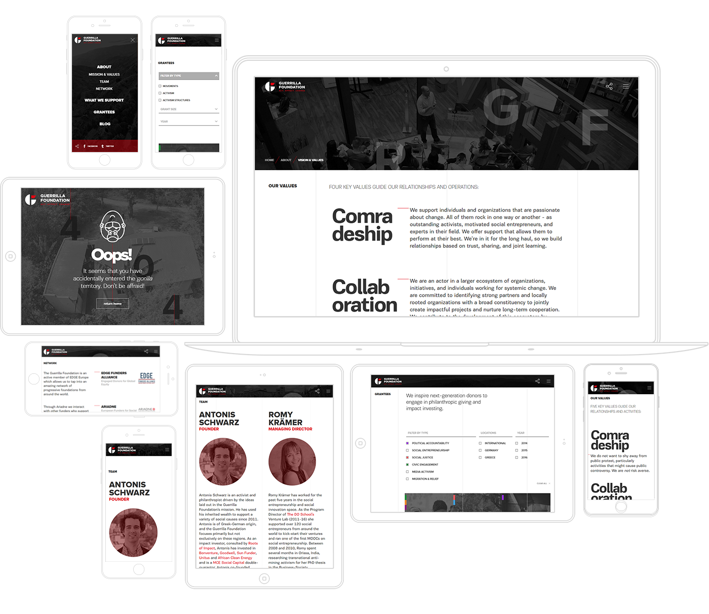
Due to the nature of the concept around the project, the art direction of the website is based on minimal design and simplicity. At the same time extravagant graphics like large animated letters at the header and the footer of the website are taking place, creating a modern look and feel to match today’s design trends.
The main wrapper of the website is divided with three thin grey lines overlapping below the images and the text, giving a feel of a grid surrounding the website. The projects (grantees) of the website are presented and filtered by category, emphasizing to the user experience both at desktop and mobile devices in order to meet the user needs. The grantee page is designed in a way that the main information of the project is scrolled along with the text content of the page to remind the user about the project he’s reading.
The overall design was a challenge due to the abstract structure of the elements having in mind that this is a responsive website. Friendly to all types of screens, it stands out for its human-centric orientation and the exceptional user experience it offers.
